Short answer: if people visit your website but you get no leads, the cause is almost always among these nine: slow loading, an unclear offer on the first screen, a complicated form, a lack of trust (no case studies or reviews), untargeted ad traffic, broken mobile UX, a weak call to action, hidden prices, or a plain technical failure of the form that nobody knows about. In 90% of cases it's a combination of 2–3 causes. You can find yours in one evening with no paid tools: walk the client's path on your phone, send a test request from every form, check the speed, and look in analytics to see where exactly the funnel breaks.
This is a diagnostic article: first we go through all nine causes with the symptoms of each, then where to look for «leaks» in the funnel, and at the end — a step-by-step check plan you can run yourself this very evening.
First, an honest question: is there any traffic at all?
Before diagnosing conversion, make sure conversion really is the problem. Open your analytics: if the site gets fewer than ~300–500 visitors a month, your problem isn't «the site doesn't convert» but «nobody sees the site», and it's treated with traffic: SEO and GEO, advertising, content. A 2% conversion on 100 visitors is two leads a month, and no form improvements will fundamentally change that.
If the traffic is there (from a few hundred targeted visits) and the leads are scarce — read on.
9 reasons visitors leave without a trace
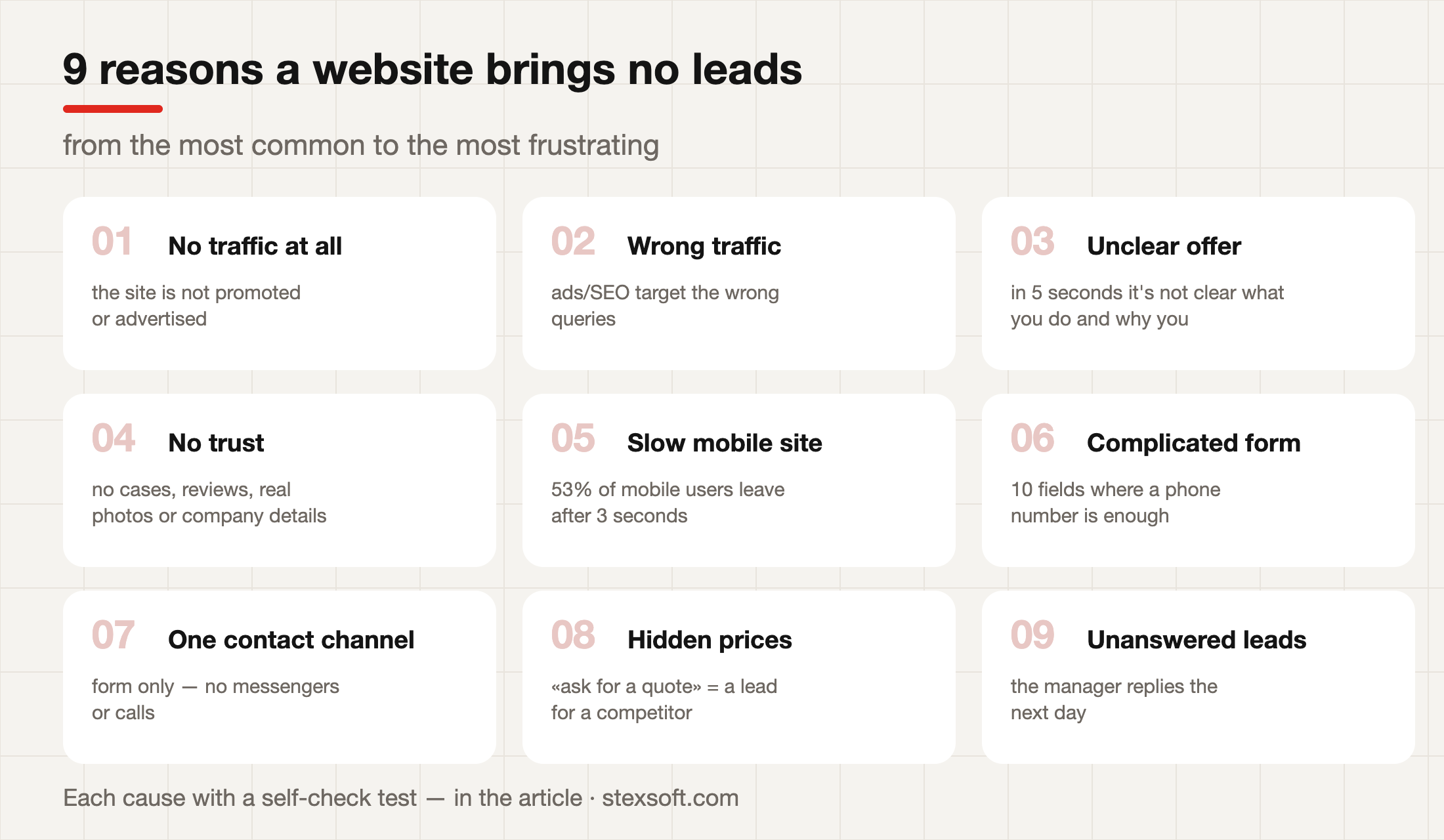
1. Slow loading. The most prosaic and most common cause: 53% of mobile users leave if a page takes more than 3 seconds to load — meaning half of your paid traffic never even sees your offer. We covered the diagnosis and the cure in detail in our article on speed and Core Web Vitals.
2. An unclear offer. The five-second rule: a new visitor should understand within 5 seconds what you offer, for whom, and why they should stay. «Innovative solutions for your business» fails this test. «Refrigerator repair in Vinnytsia within 24 hours with a one-year warranty» passes.
3. A complicated form. Every extra field costs you a share of leads. If for the first contact you ask for a name, surname, phone, email, company, job title, and «describe your task» — you're filtering out not leads but your own profit. For the first touch a name and a phone number, or one messenger, is enough.
4. No trust. Prices with no justification, zero case studies, stock photos of smiling people in suits, no company details. The Ukrainian buyer of 2026 is careful: before submitting a request they look for proof you're real — actual work, reviews with names, live photos, a clear «About us» page.
5. Untargeted traffic. The website can be perfect, but if the ads are set up «for everyone» or lead to the homepage instead of a relevant landing page — there'll be no conversion. The tell in analytics: a high bounce rate specifically from paid channels while organic looks normal.
6. Broken mobile UX. On the developer's desktop everything is fine, but on a real phone: the button is covered by the cookie banner, the form runs off the screen, the phone number in the header isn't tappable. With 70%+ mobile traffic this is a verdict.
7. A weak call to action. «Learn more» and «Submit» don't work. Specifics with a benefit do: «Get an estimate in 30 minutes», «Book a free diagnostic». And the button should be visible on every scroll screen, not only in the footer.
8. Mystery prices. «Ask the manager for the price» — and the client asks a competitor who published a range. The fear that «competitors will see our prices» costs more than the transparency itself: we tested it on ourselves by publishing a full breakdown of development prices — it's one of the highest-converting pages of our blog.
9. Technical failures. A classic: the form hasn't been submitting for three weeks since a plugin update, and the lead emails land in spam. Nobody noticed, because nobody checked. That's why a weekly test request is a mandatory ritual (or monitoring as part of a support plan).
Where exactly the funnel «leaks»
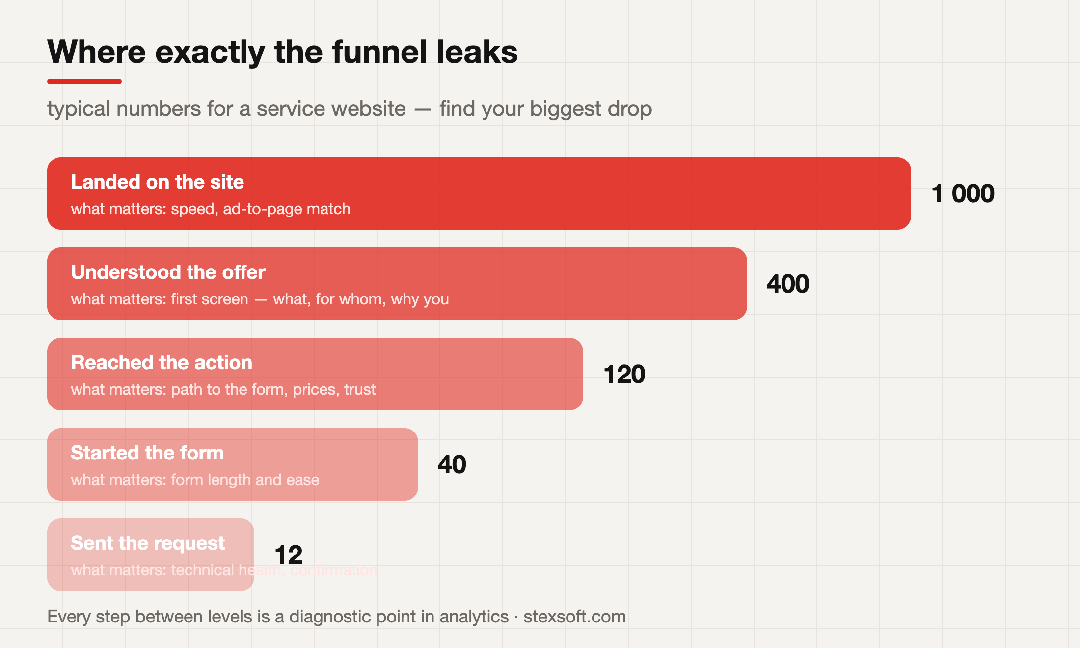
It's easier to look for the nine causes not all at once, but by where the funnel breaks:
| Stage | If the break is here — look at |
|---|---|
| Landed → stayed | speed (#1), ad-to-page match (#5) |
| Stayed → understood | first screen and offer (#2), mobile UX (#6) |
| Understood → reached the action | prices (#8), trust (#4), CTA visibility (#7) |
| Started the form → submitted | form length (#3), technical health (#9) |
In analytics this shows up in page behaviour: the bounce rate of entry pages (a break at the first stage), scroll depth and visits to the contact page (the middle), and most usefully — how many people opened the form versus how many submitted it (the bottom of the funnel). A sharp break in one place is your main cause.
The one-evening diagnostic plan
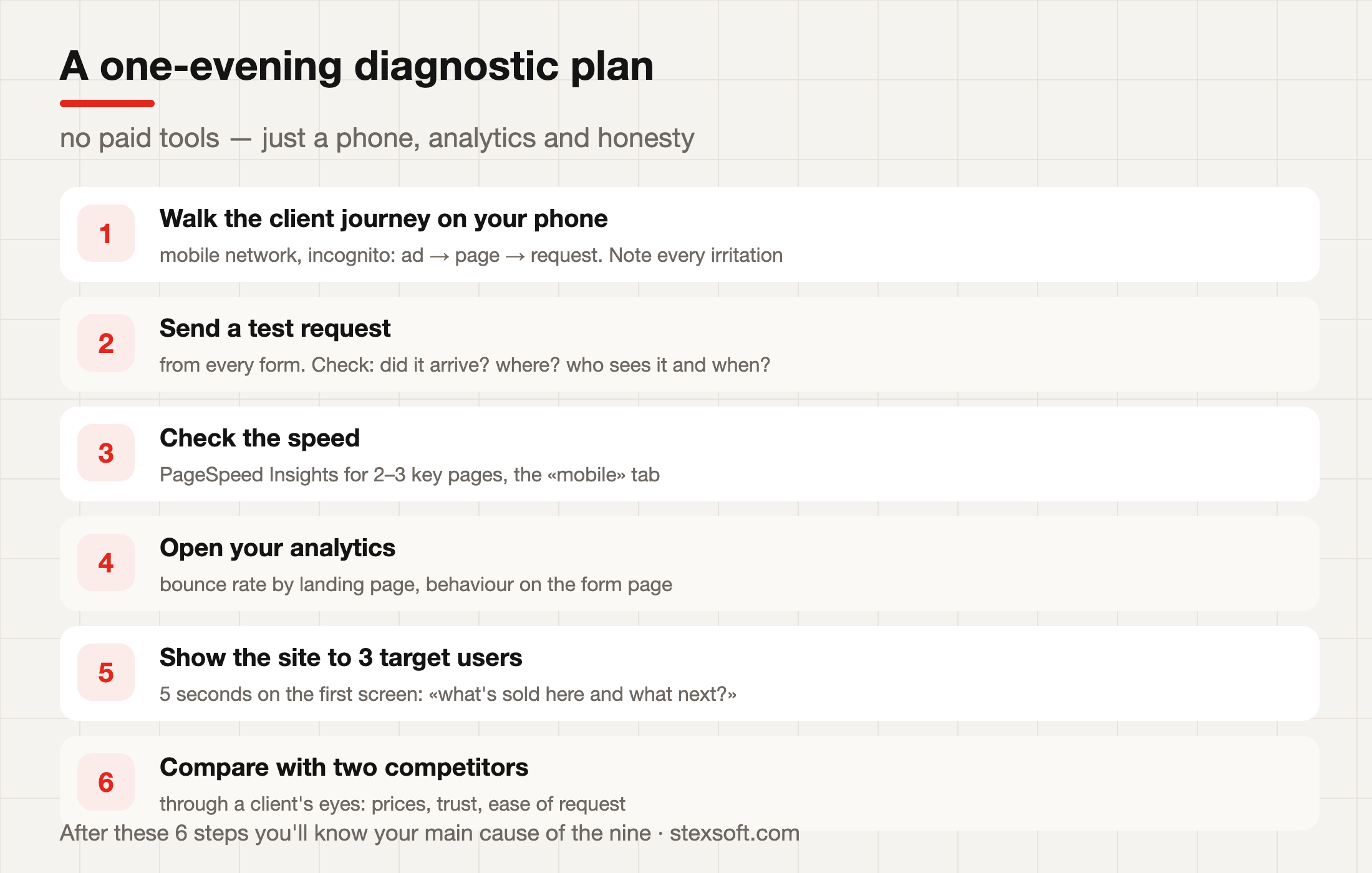
Six steps, zero costs:
- Walk the client's path on your phone. Mobile network (not Wi-Fi), incognito mode: a click from an ad or search → the page → all the way to a submitted request. Write down every irritation — that's your task list.
- Send a test request from every form. Check: did it arrive? Where exactly? Who will see it and when? As many forms — as many checks.
- Measure the speed of 2–3 key pages in PageSpeed Insights, the «mobile» tab. The red zone is where you start.
- Open your analytics: bounce rate by entry page, behaviour on the form page, breakdown by device and channel.
- Show the first screen to three people from your audience for 5 seconds and ask: «what's being sold here and what should I do?». The answers can be sobering.
- Compare yourself with two competitors through a client's eyes: whose prices are clearer, whose request is simpler, who inspires more trust?
After this evening you'll have not «the website doesn't work» but a concrete list: «LCP is 6 seconds, the form has 8 fields, leads go to the email of a manager who quit». And a concrete list is a problem already half-solved.
What's treated how: point fixes or something bigger
The good news: most of the nine causes are treated point-by-point and inexpensively — reworking the first screen and CTA, shortening the form, publishing prices and case studies, fixing the form delivery. That's a range of UAH 5,000–30,000 and 1–3 weeks.
Speed is a separate story with its own checklist. And only when point fixes hit the ceiling of an outdated platform or architecture is it time to talk about a redesign — but that's a decision made after an audit, not instead of one.
Frequently asked questions (FAQ)
StexSoft runs conversion audits: we walk your funnel, find the breaks, and hand you a prioritised plan — what to fix first and what it costs. Send us your website address — we'll start with a free express look.
What is a normal website-to-lead conversion rate?
It depends heavily on the niche and the traffic: for service websites roughly 1–5%, for stores 0.5–2% to purchase. It's more useful to compare yourself with yourself: find the break in your own funnel and remove it.
Where to start if everything on the list «sounds like us»?
With the measurable: speed and a test request (steps 2–3 of the plan). Then the first screen and the form. Trust and content come next.
How much does a conversion audit at a studio cost?
An express audit — UAH 5,000–15,000: analytics, the funnel, a UX review, a prioritised list of fixes. Pricier options include heatmaps, session recordings, and client interviews.
Will simply «updating the design» help?
If the cause is speed, the form, or the traffic — no, and it's the most expensive way to find that out. Diagnosis first, then the solution.
How do I know the problem is the traffic and not the website?
Look at conversion by channel. If organic converts several times better than ads — the site works, and the ads bring the wrong people. If it's equally bad everywhere — the problem is on the site.


Comments(0)
No comments yet — be the first.
Comments are moderated before they appear.
No comments yet — be the first.